No more second-hand lighting
I just watched the first 10% of a video tutorial on how to light a room for film or still. It began with a simple interior set, then they started adding lights. After the first few, the shot looked more and more banal with each light they added. I’ve seen this kind of thing a number of times before, where they manage to make a space look just like every other crappy, thoughtless lighting job ever done…in the interest of teaching
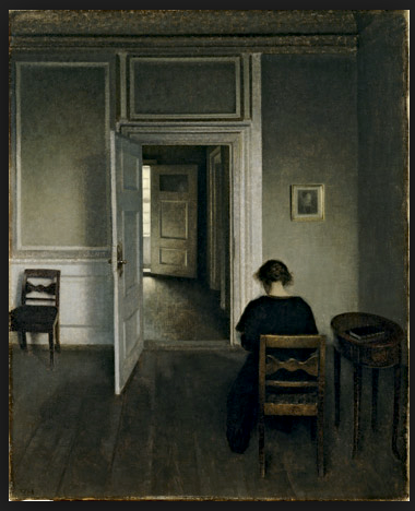
People think at some point that they need to learn how to light. What they really need to do is learn to see light, not “lighting”, and then figure out how to make something like it happen. They need to walk into a room, turn off the artificial lights, and see what they see.
For inspiration they could look at the work of the Danish painter Vilhelm Hammershøi. He was brought to my attention by Mauro Marinelli. Here is an image search link which gives a lovely idea of the way that he sees light in a room. https://www.google.com/search…
Of course, it’s always best to see the work in actual paint, and there’s a show of his work in New York at the Scandinavian House until 2/27.
Come on, people! Let’s not make work that looks like everything else. Go searching.
